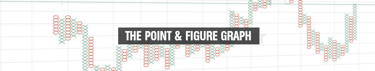
In the series of the different graph types, we have now reached one of the graphs that are not used so much more, namely the so-called Point & Figure graph.
The Point & Figure graph is one of the oldest and most simple ways to draw a graph in technical analysis. The graph consists of a number of markings with either X or O.
An example of the Point & Figure graph is seen below on gold:
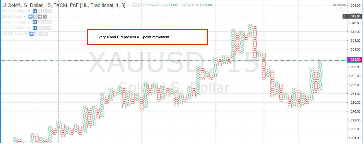
In this case, the Point & Figure graph is set to be a 1-point graph. This means that an X or O is marked each time the market moves 1 point. However, there must be three-point motion in the opposite direction until you can plot it. That is, if the market has increased by 10 points, then 10 crosses are drawn in a row. If the market then drops by 2 points before it rises again, no buns will be drawn, with three points moving always. Of course, it can be changed to other values in the settings.
Back in the early days of technical analysis, this graph type (along with the line graph) was one of the most preferred, making it easy to draw on a squared sheet of paper, and not least because of the very rapid appearance of peaks , bottoms, support levels, resistance levels, etc. These are just some of the decisive reasons why we are always working with technical analysis.
An important factor to notice here is that there is no time factor involved. If the market is going nowhere or almost does not move for 10 consecutive hours, nothing will be drawn on the graph at all. It is only when the market moves 1 point, that an X or O will be drawn.
A simple buy signal on the Point & Figure graph could look like this:
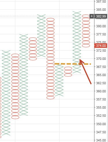
We have had a number of crosses up, three buns down and then four crosses up so we get a break up over the last rows crossing. This is the most simple purchase signal in this graph type.
In comparison to the bar graph and candlestick graph, this graph type is incredibly clean to look at. There is not much more than up and down moves. This can both be an advantage and disadvantage.
The advantage of this type of graph is that you are not tempted to act on a lot of bad signals. A signal cannot be interpreted, it can only be buy or non-buy, sell or non-sell. There are no “maybe”. So for a trader with a tendency to trade too frequently, for example, because of impatience, this type of graph might be the right one.
Conversely, there is also some information that goes lost in a point & figure graph. It is as easy to see the so-called Price Action, where all the nuances from eg. candlestick graph are expressed. As with so much else in day and swingtrading, it depends on the temperament and the trading style of what you choose.
However, I have to say that I do not know a single daytrader who uses the point & figure graph.