One of the graph types that many daytraders are starting to use is the so-called Heikin-Ashi graph.
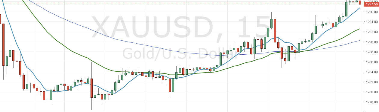
This graph looks very much like ordinary candlesticks at first glance, but there are some fairly important differences. Heikin-Ashi is Japanese and means something like average speed. When this graph type is to be displayed, it does not only use the open, high, low and closing price for the individual timeframe. At Heikin-Ashi, you use both data for the current timeframe and for the previous one, where you calculate the average for the two different ways. We do not want to go into detail with the calculations here, but the difference between the two is seen here where we look at gold on a 15-minute timeframe.
First, we see the chart with ordinary candlesticks:
And now we look at exactly the same market, just displayed as a Heikin-Ashi graph:
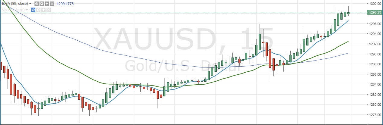
As you may see, we get a much calmer picture here. There is almost always multiple consecutive series of red and green candles when using Heikin-Ashi, using the average between the different candles. This causes some more movement before the individual bars change color. Many daytraders like this, as it is easier to stay in a long trend because of the long periods of consecutive bull/bear candles.
There is, of course, a backside to this graph type, as it does not respond so quickly and does not show the same instantaneous differences in the graph as the battle between buyers and sellers intensifies. But for many, this is a small price to pay if you can get a more calm graph to look at when you analyze the market.
Video
Below is a video that elaborates on the article and comes with several examples.