In the series of different graph types, we have now reached the bar graph.
In a bar graph, the line, as we saw in the line graph, is now broken up. So if you have a share as we saw earlier, the graph now consists of a number of separate points that tell us a lot of important information if we know what to look for.
Here’s an example of the bar graph:
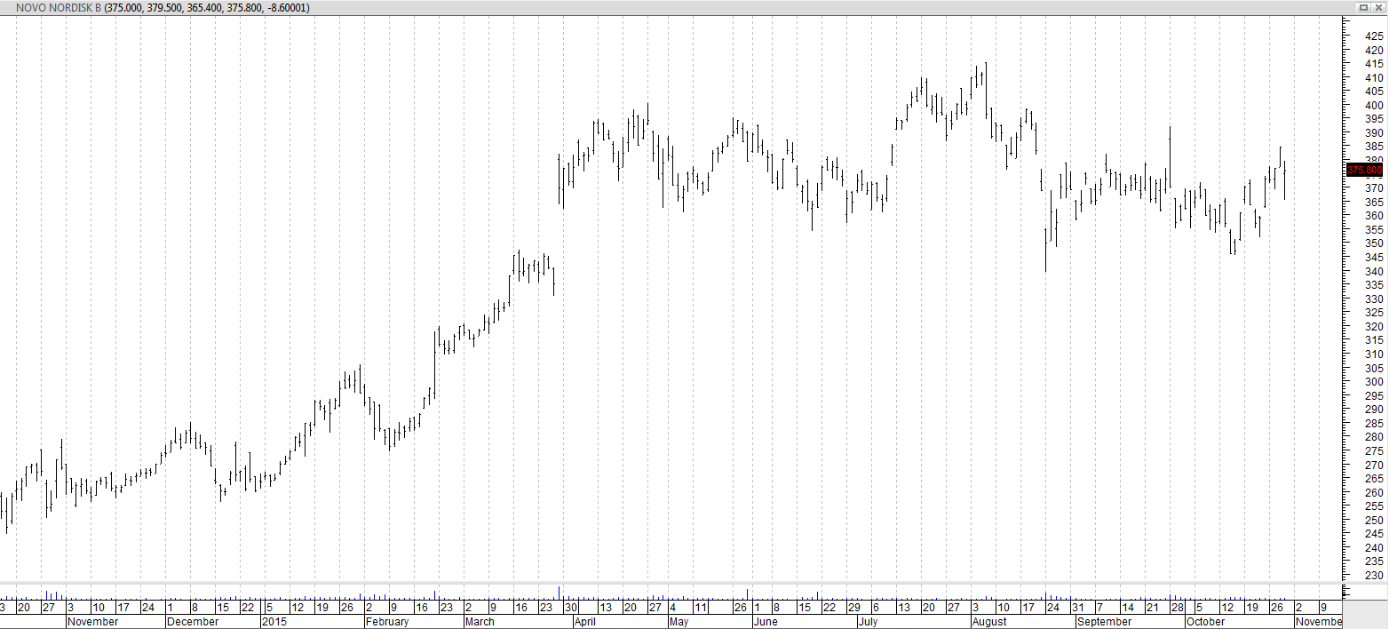
Now it can be a little hard to see the details of each bar, so let’s look at how these bars are built.
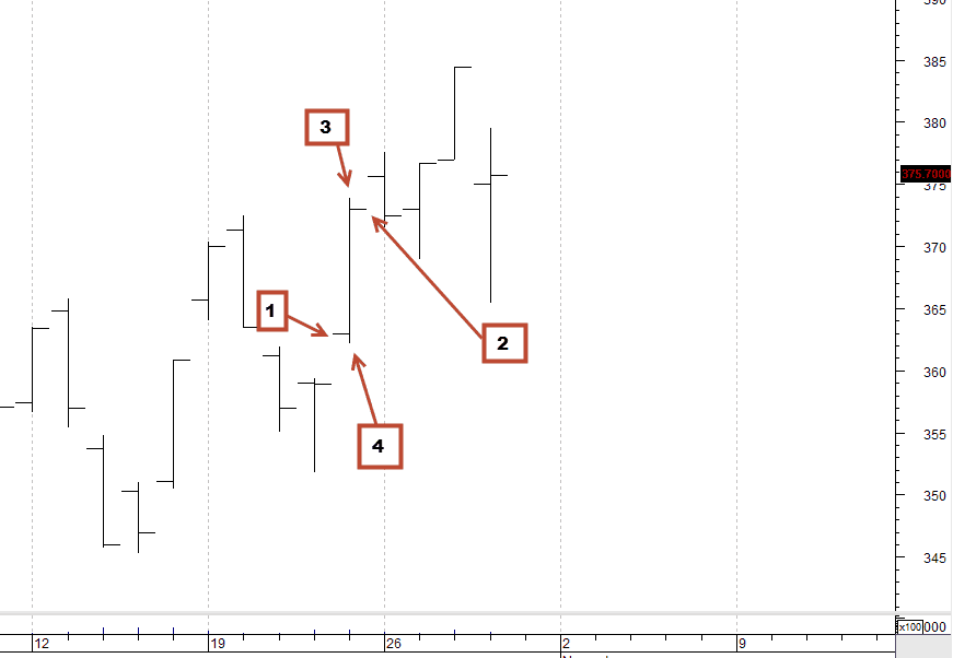
Here you can see that each day in this graph gives us four different pieces of information in the form of the following:
1. Open price
2. The closing price
3. The highest price the instrument has traded during the time period
4. The lowest price the instrument has traded during the time period
Once we have these four pieces of information, we can begin to extract a little more information of our graph.
For example, we can see if the buyers have been strong during the day (starting and closing shows a big increase, and if there is hardly any difference between “High” and “Close”). Or we can see if there has been great uncertainty in the market eg. starting and closing are almost on the same level, but High and Low shows large fluctuations throughout the day.
An example of this extra layer of information in the bar graph can be seen here:
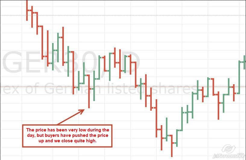
This is a daily graph of the German DAX index. In this graph, we get the extra visual help that the down-days are colored red and the up-days are colored green. This gives a quick overview of whether buyers or sellers have the power.
On the day indicated by the arrow, we opened high at the bar. The opening price is the highest point of the day. Immediately, one should think that this was a very negative day because the index has fallen. But by studying the bar graph, a slightly different picture is formed. Because we can see that the sellers at some point have had the price pressed very far down. Hereafter the buyers have come and pushed the price in the top half of the bar as the market closes for the evening. This does not necessarily mean an increase in the following days, but it tells a more nuanced story of who wins the market at different times of the day.
When a trader talks about the concept of Price Action, it is often a study of these buyer/seller relationships that are meant.
Today there is a large group of traders who do not use anything else than the pure raw price data set up in exactly such a way in a graph. However, the bar graph was most popular until 10-15 years ago. Since then, another graph type has been the most popular. This graph type is originated from Japan, where it has been used for centuries and is called the candlestick graph.
Video
Below is a video that elaborates on the article and comes with several examples.