In the series of different graph types, we have now reached the candlestick graph.
As mentioned in the bar graph article, the candlestick chart has gone and become one of the most popular graph types among traders today. Candlestick is the English word for light or candles, which you can see the context in when you see how the candlestick graph looks.
Let’s try to zoom in on the individual parts of the candlestick chart.
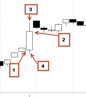
In the candlestick graph you get the same information as in the bar graph:
1. Open price
2. The closing price
3. The highest price the instrument has traded during the time period
4. The lowest price the instrument has traded during the time period
So why use the candlestick chart instead of the bar graph?
Well, this has something to do with what you call the body. The body is the white field, which is a square between the open and closing price. In the above case, the body is white because the closing price is higher than the open price.
If the market had reversed, it would have looked like this:
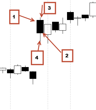
Exactly the same information. But now the body is black because the market has fallen.
This means that in addition to getting information about open, close, high and low on the day, we can quickly get an overview of whether buyers or sellers are strongest in a given period.
It could, for example, look like this:
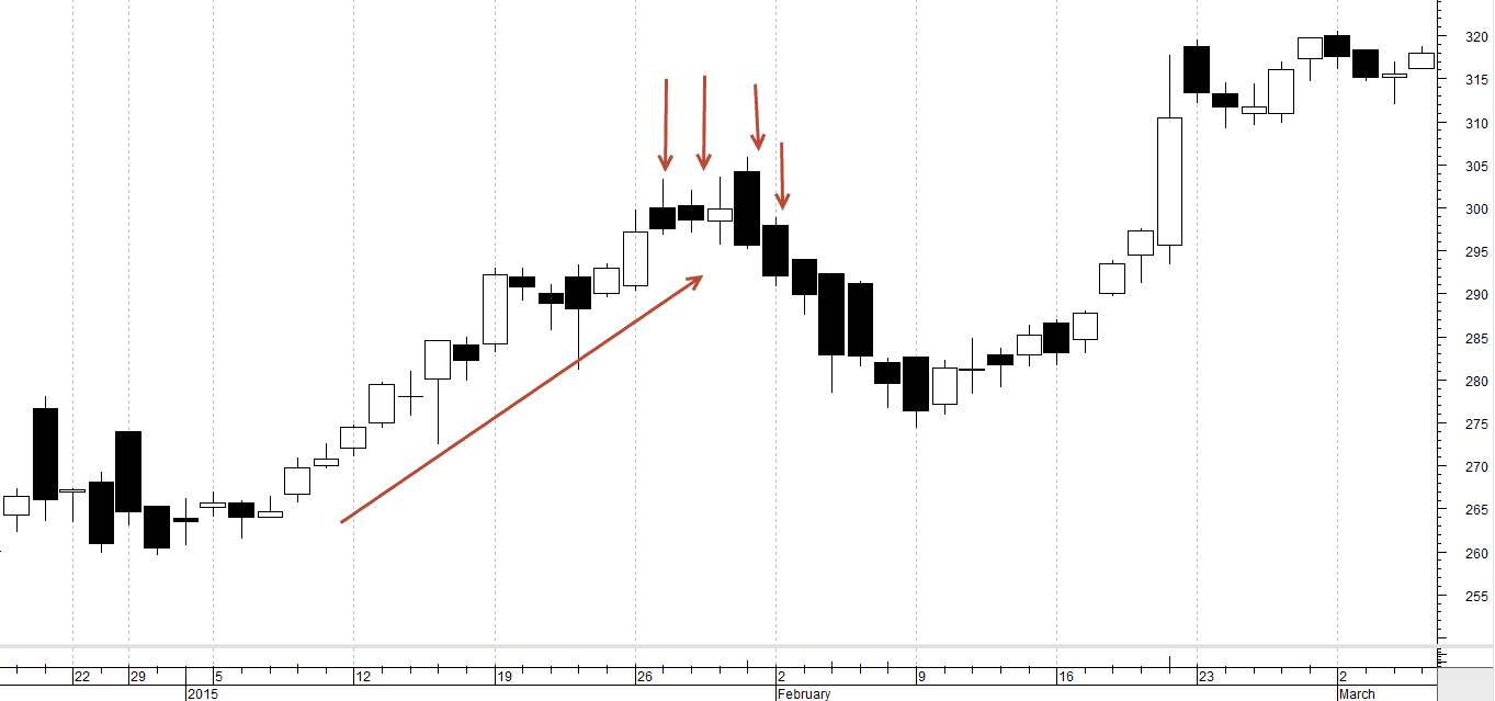
On top of that, the price is rising, as most candles are white.
Subsequently, the market begins to move sideways, but we can see that most candles are suddenly black. It means, therefore, that we do not move so much, but that it is the sellers who are strongest and push down the price almost every day.
This is a very small part of what you call Price Action, which we will probably write much more about later. But first, it is important to understand how the price graph is built up.
We are witnesses to a constant auction
As mentioned above, the graphs show something about the relationship between the buyers and the sellers in the market.
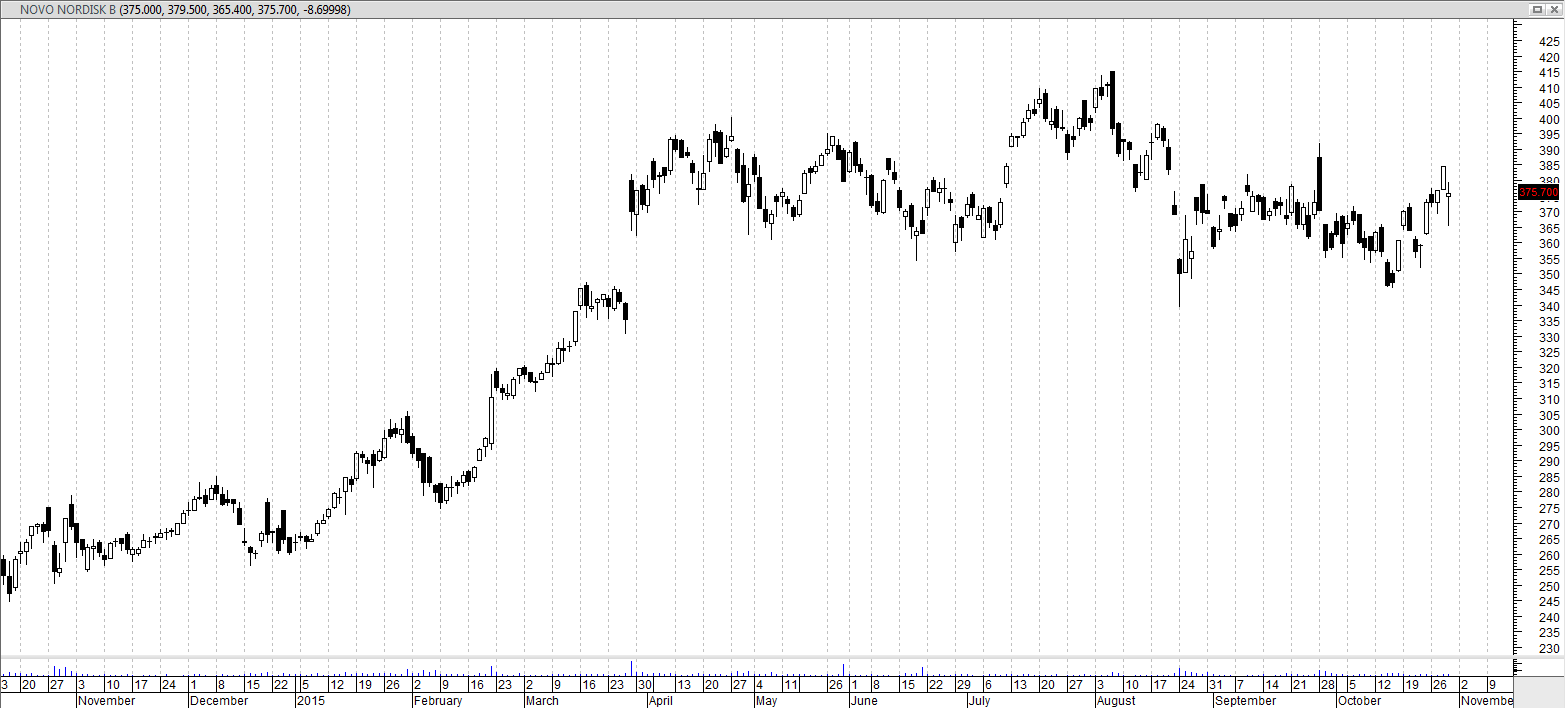
Financial markets are in a constant debate about what the individual instruments are worth. Therefore learning to read these graphs can be very beneficial to find out if the course is going up or down in the coming period.
Many daytraders are looking at pinbars in candlestick graphs and bar graphs. Pinbars are bars in the graph, where the market has first been in one direction, but either buyers or sellers enter and press the market in the opposite direction.
Below is an example of a pinbar on the gold on the 15-minute graph:
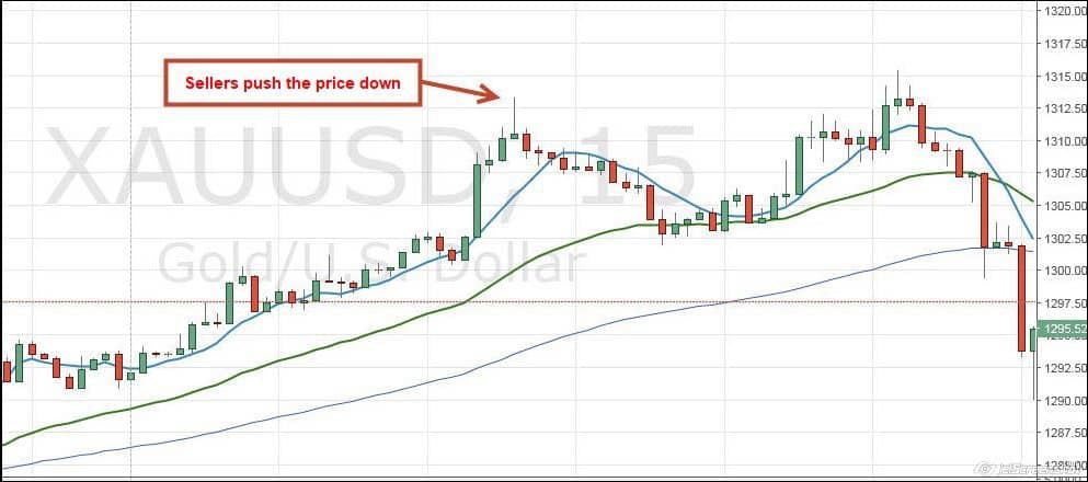
Above we can see that gold has been in a rising trend. The green candles have been the strongest, but suddenly there is a change. As we know from earlier, it shows the highest point on a candlestick where the prize has been, here maximum in a 15-minute period. Here we can see that the price has remained high, after which the sellers have entered the market and have sent the price downwards. After this, the price drops to about 1.302.5 – then to rise again. But a couple of hours later, exactly the same happens again at a price of 1.315.0, after which the price really gets pushed down.
This is not an article directly about these chart patterns, but as you probably can sense, you can earn very good money to spot these trends, strengths, and weaknesses simply by looking at the individual candlesticks – and the relationship between the different bars.
Video
Below is a video that elaborates on the article and comes with several examples.