The Renko chart works in principle much like the Point & Figure chart. A variation of this type of chart is the so-called Renko chart.
We can start by looking at it in the gold market where the Renko chart looks like:
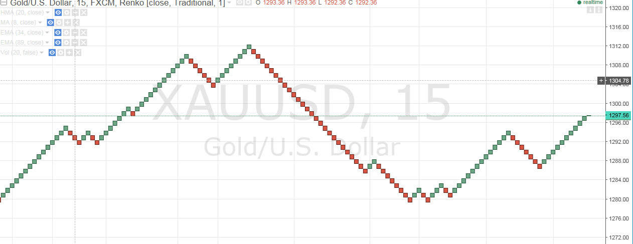
Here we can see the simplest chart of all apart from the line chart.
The chart is again set to a 1-point sensitivity in gold as an example. Here the falls are marked with red boxes and the green boxes. As with the Point & Figure chart, the time factor is also peeled out of the equation. If no movement occurs, no boxes are drawn in the chart.
As you may feel, we are sitting here with a simple chart, but nevertheless with a chart telling us about many of the important factors such as support, resistance, tops, bottoms etc. There could be, for example, in this chart, trendlines as drawn below:
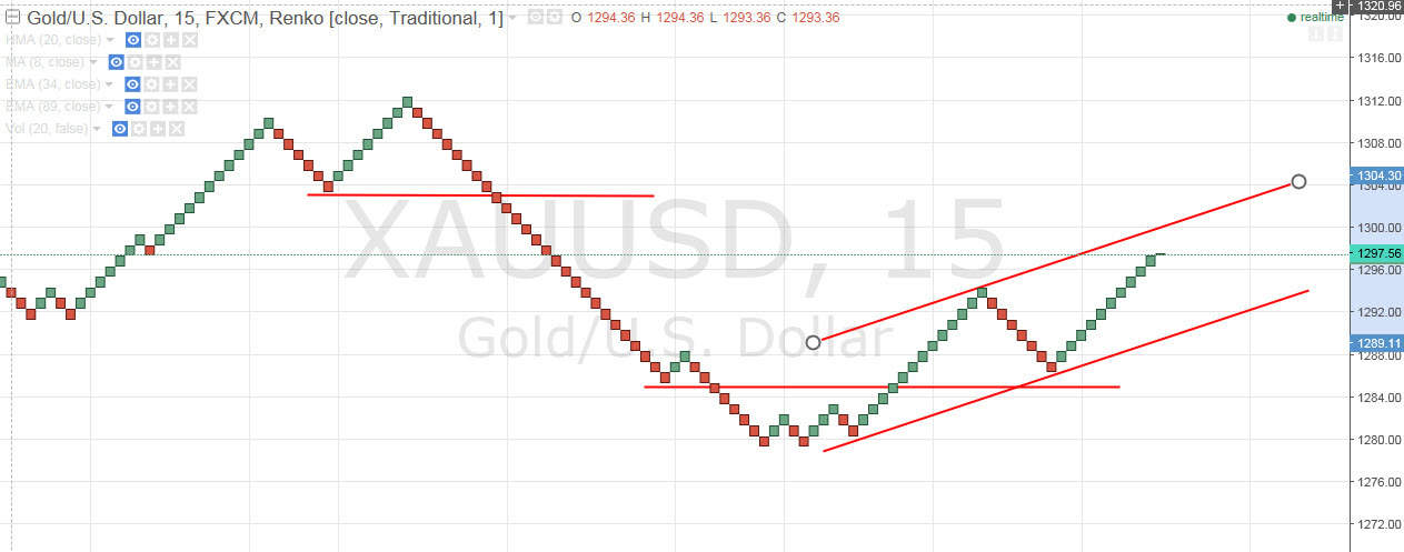
The advantage is clearly that there is already unnecessary noise and information removed from the chart, so we only need to relate to the completely raw market movements.
The downside is that you can not get the same feel for the struggle between buyers and sellers as you could on or example a candlestick chart.
Video
Below is a video that expands on the article and provides more examples.